 CSS3 新特性
# CSS3 新特性
如同人类的的进化一样,CSS3是CSS2的“进化”版本,在CSS2基础上,增强或新增了许多特性, 弥补了CSS2的众多不足之处,使得Web开发变得更为高效和便捷。
# 结构性伪类选择器(重点)
结构性伪类选择器是CSS3中新增加的类型选择器。常用的的结构性伪类选择器如下所示:
- :nth-child(n) 对指定序号的子元素设置样式(从前往后数)。参数可以使数字(1、2、3)、关键字(odd、even)、公式(2n、2n+3 :使用公式时,n从0开始),参数的索引起始值时1,而不是0。
- :nth-of-type(n) 匹配指定序号的同一种类型的子元素(从前往后数)。参数同上。
<!DOCTYPE html>
<html lang="en">
<head>
<meta charset="UTF-8">
<meta http-equiv="X-UA-Compatible" content="IE=edge">
<meta name="viewport" content="width=device-width, initial-scale=1.0">
<title>Document</title>
<style>
/* i:nth-child(n):n从1开始 */
/* odd:奇数
even:偶数 */
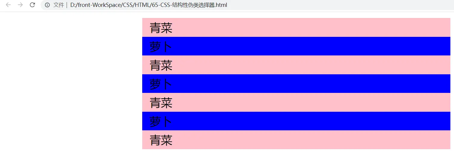
ul li{
list-style-type: none;
height: 50px;
/* text-align: center; */
line-height: 50px;
padding-left: 20px;
font-size: 30px;
width: 800px;
margin: 0 auto;
}
li:nth-child(even){
/* color: red; */
background-color: blue;
}
li:nth-last-child(odd){
background-color: pink;
}
</style>
</head>
<body>
<ul>
<li>青菜</li>
<li>萝卜</li>
<li>青菜</li>
<li>萝卜</li>
<li>青菜</li>
<li>萝卜</li>
<li>青菜</li>
</ul>
</body>
</html>
1
2
3
4
5
6
7
8
9
10
11
12
13
14
15
16
17
18
19
20
21
22
23
24
25
26
27
28
29
30
31
32
33
34
35
36
37
38
39
40
41
42
2
3
4
5
6
7
8
9
10
11
12
13
14
15
16
17
18
19
20
21
22
23
24
25
26
27
28
29
30
31
32
33
34
35
36
37
38
39
40
41
42
- 结果
<!DOCTYPE html>
<html lang="en">
<head>
<meta charset="UTF-8">
<meta http-equiv="X-UA-Compatible" content="IE=edge">
<meta name="viewport" content="width=device-width, initial-scale=1.0">
<title>Document</title>
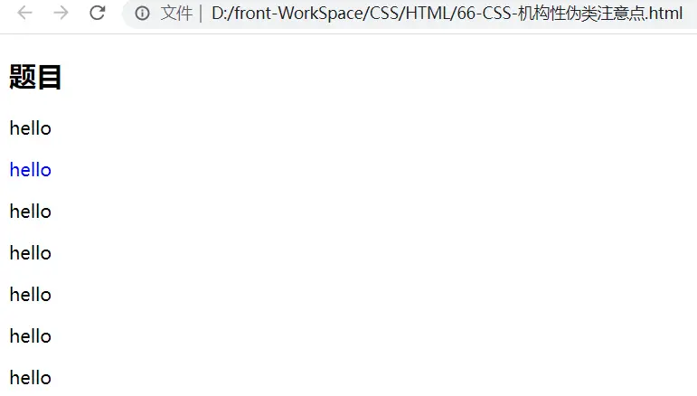
<!-- 只在同类型标签中进行选择 -->
<style>
p:nth-of-type(2) {
color: blue;
}
</style>
</head>
<body>
<div>
<h2>题目</h2>
<p>hello</p>
<p>hello</p>
<p>hello</p>
<p>hello</p>
<p>hello</p>
<p>hello</p>
<p>hello</p>
</div>
</body>
</html>
1
2
3
4
5
6
7
8
9
10
11
12
13
14
15
16
17
18
19
20
21
22
23
24
25
26
27
2
3
4
5
6
7
8
9
10
11
12
13
14
15
16
17
18
19
20
21
22
23
24
25
26
27
- 结果
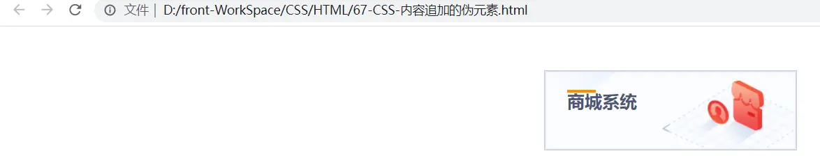
# 内容追加伪元素(重点)
::before:向当前的元素前面追加内容(创建一个伪元素,其将成为匹配选中的元素的第一个子元素)
::after:向当前的元素内容后面追加内容(创建一个伪元素,作为已选中元素的最后一个子元素)
//在每个 <p> 元素前面插入内容,并设置所插入内容的样式:

p:before
{
    content:"开心";
    background-color:yellow;
    color:red;
    font-weight:bold;
}
a::after {
  content: "每一天";
}
1
2
3
4
5
6
7
8
9
10
11
12
<!DOCTYPE html>
<html lang="en">
<head>
    <meta charset="UTF-8">
    <meta http-equiv="X-UA-Compatible" content="IE=edge">
    <meta name="viewport" content="width=device-width, initial-scale=1.0">
    <title>Document</title>
    <style>
        * {
            margin: 0;
            padding: 0;
        }
        .top {
            width: 287px;
            height: 90px;
            border: 1px solid #ccc;
            margin: 50px auto;
            background: url(images/2f-bg1.jpg);
        }

        .top h3 {
            color: #4F5573;
            font-size: 20px;
            padding: 22px 0 10px 25px;
            position: relative;

        }

        /* 伪元素本来可以起到修饰作用,来实现横线 */
        /* 本身伪元素默认为行内元素 */

        .top h3::before {
            content: '';
            /* display: block; */
            position: absolute;
            width: 33px;
            height: 3px;
            background-color: darkorange;
        }
    </style>
</head>
<body>
    <div class="top">
        <h3>商城系统</h3>
    </div>
</body>
</html>
1
2
3
4
5
6
7
8
9
10
11
12
13
14
15
16
17
18
19
20
21
22
23
24
25
26
27
28
29
30
31
32
33
34
35
36
37
38
39
40
41
42
43
44
45
46
47
2
3
4
5
6
7
8
9
10
11
12
13
14
15
16
17
18
19
20
21
22
23
24
25
26
27
28
29
30
31
32
33
34
35
36
37
38
39
40
41
42
43
44
45
46
47
- 结果
# CSS3新增样式属性
# background-image的渐变
渐变配色推荐网站:https://webgradients.com/ (opens new window)
# 线性渐变(重点)
语法
background-image: linear-gradient(direction, color-stop1, color-stop2, ...);
1
- direction:预定义方向(to bottom、to top、to right、to left、to bottom right,等等)。
- 定义一个角度
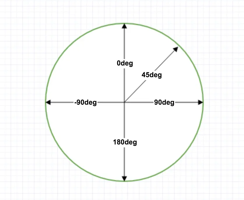
如果不设置direction,那么从头部开始的线性渐变,从红色开 始,转为黄色,再到蓝色:
#grad {
	width:200px;
	height: 200px;
    background-image: linear-gradient(red, yellow, blue);
}
1
2
3
4
5
2
3
4
5
其他线性渐变:
#grad {
  background-image: linear-gradient(to bottom right, red , yellow);
}
#grad {
  background-image: linear-gradient(to right, red , yellow);
}
1
2
3
4
5
6
2
3
4
5
6
<!DOCTYPE html>
<html lang="en">
<head>
<meta charset="UTF-8">
<meta http-equiv="X-UA-Compatible" content="IE=edge">
<meta name="viewport" content="width=device-width, initial-scale=1.0">
<title>Document</title>
<style>
.con div {
width: 200px;
height: 200px;
float: left;
}
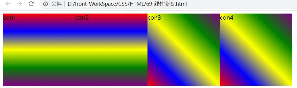
.con1 {
background-image: linear-gradient(red,blue,yellow,green,purple);
}
.con2 {
/* 从上到下 */
background-image: linear-gradient(to bottom,red,blue,yellow,green,purple);
}
.con3 {
/*到右上 */
background-image: linear-gradient(to top right,red,blue,yellow,green,purple);
}
.con4 {
background-image: linear-gradient(45deg,red,blue,yellow,green,purple);
}
</style>
</head>
<body>
<div class="con">
<div class="con1">
con1
</div>
<div class="con2">
con2
</div>
<div class="con3">
con3
</div>
<div class="con4">
con4
</div>
</div>
</body>
</html>
1
2
3
4
5
6
7
8
9
10
11
12
13
14
15
16
17
18
19
20
21
22
23
24
25
26
27
28
29
30
31
32
33
34
35
36
37
38
39
40
41
42
43
44
45
46
47
48
2
3
4
5
6
7
8
9
10
11
12
13
14
15
16
17
18
19
20
21
22
23
24
25
26
27
28
29
30
31
32
33
34
35
36
37
38
39
40
41
42
43
44
45
46
47
48
- 结果
# CSS3的opacity 属性(重点)
opacity 属性是设置元素的不透明级别
语法
opacity: value|inherit;
1
| 值 | 描述 |
|---|---|
| value | 规定不透明度。从 0.0 (完全透明)到 1.0(完全不透明)。 |
| inherit | 应该从父元素继承 opacity 属性的值。 |
<!DOCTYPE html>
<html lang="en">
<head>
<meta charset="UTF-8">
<meta http-equiv="X-UA-Compatible" content="IE=edge">
<meta name="viewport" content="width=device-width, initial-scale=1.0">
<title>Document</title>
<style>
* {
margin: 0;
padding: 0;
}
div {
width: 300px;
height: 300px;
float: left;
margin-right: 50px;
}
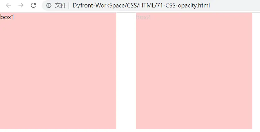
.box1 {
background-color: rgba(255,0,0,0.2);
}
.box2 {
/* 整个盒子的不透明度0-1,0完全消失看不见s */
opacity: 0.2;
background-color: #f00;
}
</style>
</head>
<body>
<div class="box1">box1</div>
<div class="box2">box2</div>
</body>
</html>
1
2
3
4
5
6
7
8
9
10
11
12
13
14
15
16
17
18
19
20
21
22
23
24
25
26
27
28
29
30
31
32
33
34
2
3
4
5
6
7
8
9
10
11
12
13
14
15
16
17
18
19
20
21
22
23
24
25
26
27
28
29
30
31
32
33
34
- 结果
# CSS3的filter(滤镜) 属性
filter 属性定义了元素(通常是)的可视效果
语法
filter: grayscale(100%) | blur(px);
1
| 值 | 描述 |
|---|---|
| grayscale | 将图像转换为灰度图像。值定义转换的比例。值为100%则完全转为灰度图像,值为0%图像无变化。值在0%到100%之间,则是效果的线性乘子。若未设置,值默认是0; |
| blur(px) | 给图像设置高斯模糊。"radius"一值设定高斯函数的标准差,或者是屏幕上以多少像素融在一起, 所以值越大越模糊; 如果没有设定值,则默认是0;这个参数可设置css长度值,但不接受百分比值。 |
<!DOCTYPE html>
<html lang="en">
<head>
<meta charset="UTF-8">
<meta http-equiv="X-UA-Compatible" content="IE=edge">
<meta name="viewport" content="width=device-width, initial-scale=1.0">
<title>Document</title>
<style>
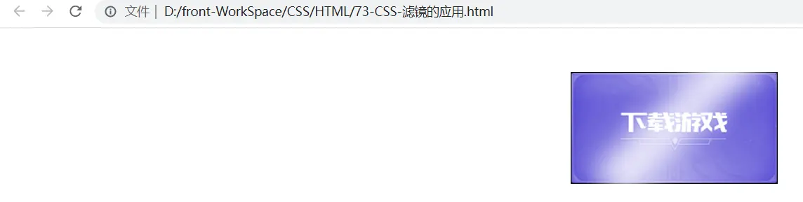
.download_btn {
width: 236px;
height: 128px;
background: url(images/download.png) no-repeat;
display: block;
margin: 50px auto;
transition: all 5s;
/* 父元素 */
position: relative;
/* 在父元素上设置overflow */
overflow: hidden;
}
.shandian {
width: 300px;
height: 50px;
background-color: rgba(255,255,255,0.8);
/* display: block; */
/* 旋转的 */
transform: rotate(-45deg);
/* 高斯模糊 */
filter: blur(15px);
/* 子元素 */
position: absolute;
}
</style>
</head>
<body>
<a href="" class="download_btn">
<span class="shandian"></span>
</a>
</body>
</html>
1
2
3
4
5
6
7
8
9
10
11
12
13
14
15
16
17
18
19
20
21
22
23
24
25
26
27
28
29
30
31
32
33
34
35
36
37
38
39
40
41
42
43
2
3
4
5
6
7
8
9
10
11
12
13
14
15
16
17
18
19
20
21
22
23
24
25
26
27
28
29
30
31
32
33
34
35
36
37
38
39
40
41
42
43
- 结果
上次更新: 2024/04/21, 09:42:22